Turning Your AncestryDNA Results into an Infographic with Google NotebookLM
Ethnicity results are data rich but visually flat. You get percentages, subregions, and migration maps, but they live on separate screens. I wanted to see what would happen if I combined all of that into a single visual story.
So I used Google NotebookLM to turn my AncestryDNA results into an infographic.
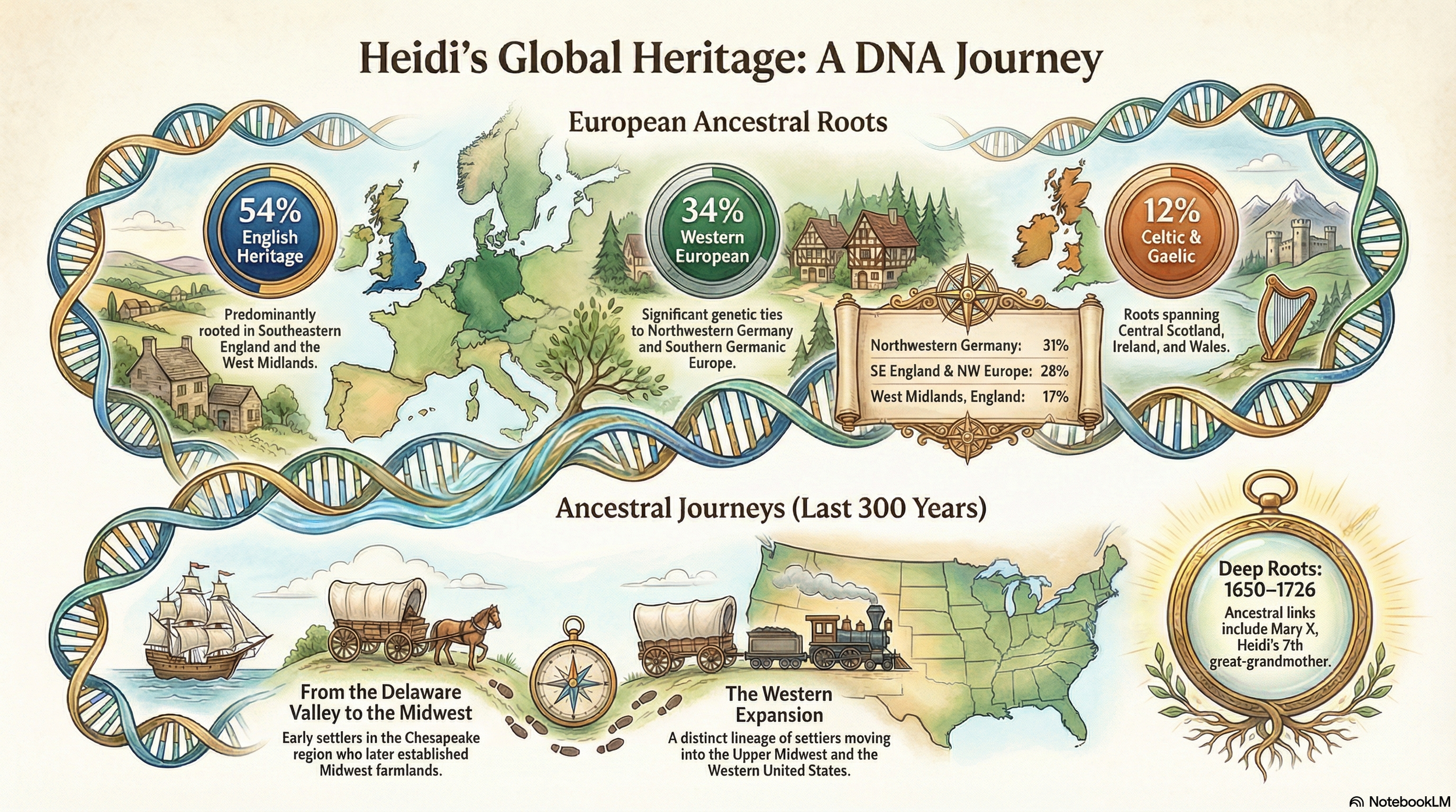
Google NotebookLM inforgraphic output
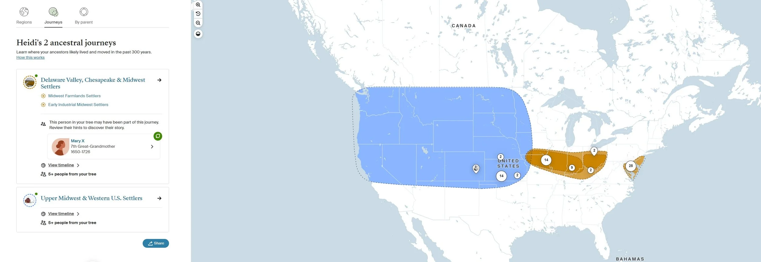
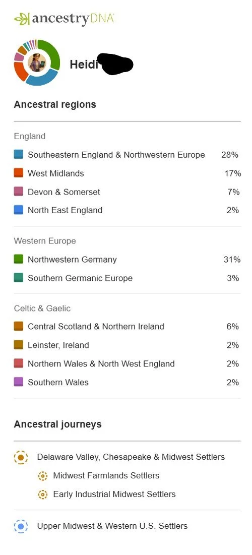
I uploaded files that I screenshot and downloaded directly from my AncestryDNA account, including my regional percentages, subregional breakdowns, and ancestral journeys. The three files I included are below.
This information I cut and pasted from Ancestry
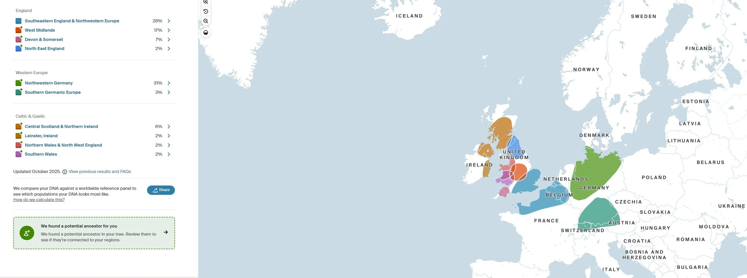
This information I cut and pasted from Ancestry
This information I downloaded from Ancestry using the “Share” button
I chose and Infographic output from Google NotebookLM, and iterated a few times on the prompt. My prompt included a specific instruction: pay special attention to spelling, make each vignette beautiful and interesting to look at, and index on aesthetics and visual storytelling.
That final instruction made the difference.
NotebookLM did not invent new data. It worked strictly from the materials I uploaded. It grouped my English, Western European, and Celtic percentages into cohesive sections, integrated the Delaware Valley and Midwest migration journeys, and presented everything as a flowing ancestral narrative rather than disconnected statistics.
Because NotebookLM stays grounded in uploaded sources, this workflow is especially useful for genealogists. It does not pull from the open web or reinterpret ethnicity categories. It simply organizes and designs from your files. That containment makes it far safer than using a general chat tool for something like this.
It is important to remember that ethnicity estimates are just that. They are population comparisons, not proof of specific ancestors. The infographic is a visual interpretation of those reported estimates, not new evidence.
What I like most about this approach is that it bridges the gap between research and presentation. Genealogists are often strong on documentation but weak on visual storytelling. NotebookLM makes it possible to convert percentages, subregions, and migration paths into something you could share with family, include in a heritage book, or use in a presentation.
The key is simple: upload only your source material, keep the tool grounded, and be explicit about the kind of output you want. When you treat AI as a design assistant rather than a historian, it becomes a powerful way to present your own research clearly and responsibly.